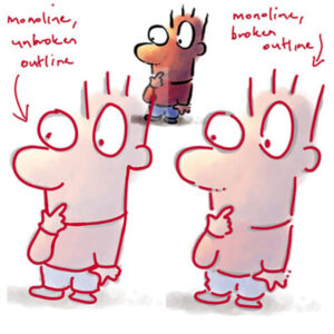
On Monday, I received the following cartoon outlines question… maybe you were asking this after last week’s cartoon outlining post, too?
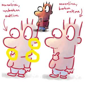
A question … in the broken-unbroken example, I’m wondering why the “unbroken” line picture has “broken lines” or isn’t one continuous line everywhere, yet it’s called unbroken?
I guess what I’m asking is how do we determine broken line vs unbroken and why does it matter? Is it about controlling the amount of dynamic-ness in the drawing?
And of course, when you look at the yellow-circled areas above you can see there are definite gaps – perfect for causing confusion 🤨.
I was extra happy to have the cartoon outline anomaly pointed out
Why did I instinctively leave those gaps in the cartoon outline when it illustrated ‘unbroken’ outlines?
It’s because the gaps leave “breathing room” where one body part meets, overlaps or inserts into another. In this example, where the hand crosses the face and neck, where the shoulder meets the neck, where the ear meets the neck.
You’ll also notice breaks in the lines where the outline changes direction. At a corner, for example. That is where you tend to lift your pen and put it down again to draw the next section of line. This is because keeping the pen down to draw round a sharp corner seldom delivers a crisp result.
Another reason is that getting two lines to meet exactly, and at the perfect width, is hard to pull off so a gap is a better bet than an imperfect join.
I confess, all that mental exploration got me curious
So I went back and made a perfect, complete outline for comparison … and guess what?
It doesn’t look too bad at all! Take a look for yourself 👇🏼

Which basically reinforces the point that it’s entirely up to you to choose – you are the artist, you get to decide on the style of your outline: broken, unbroken, thick, thin or variable-width.
Bear in mind that what you like will also shift as your your skills develop and your personal style shifts and develops alongside them.
