It was a night to remember at our local theatre
The red velvet curtains shimmied upwards to reveal a tiny figure clad in a grey mouse costume, skewered to the stage by the glare of the spotlight. The mouse’s pink muzzle was a-tremble with terror and when a giant ginger cat pounced towards her… she burst into floods of tears and fled in an ignominious, unscripted Exit Stage Left.
Behold the finale of my modern dance career, curtailed around the tender age of 5 years ??
I still choose to avoid the spotlight (confirmed introvert here) but I refuse to let my characters do the same, especially when I’m drawing black and white cartoons.
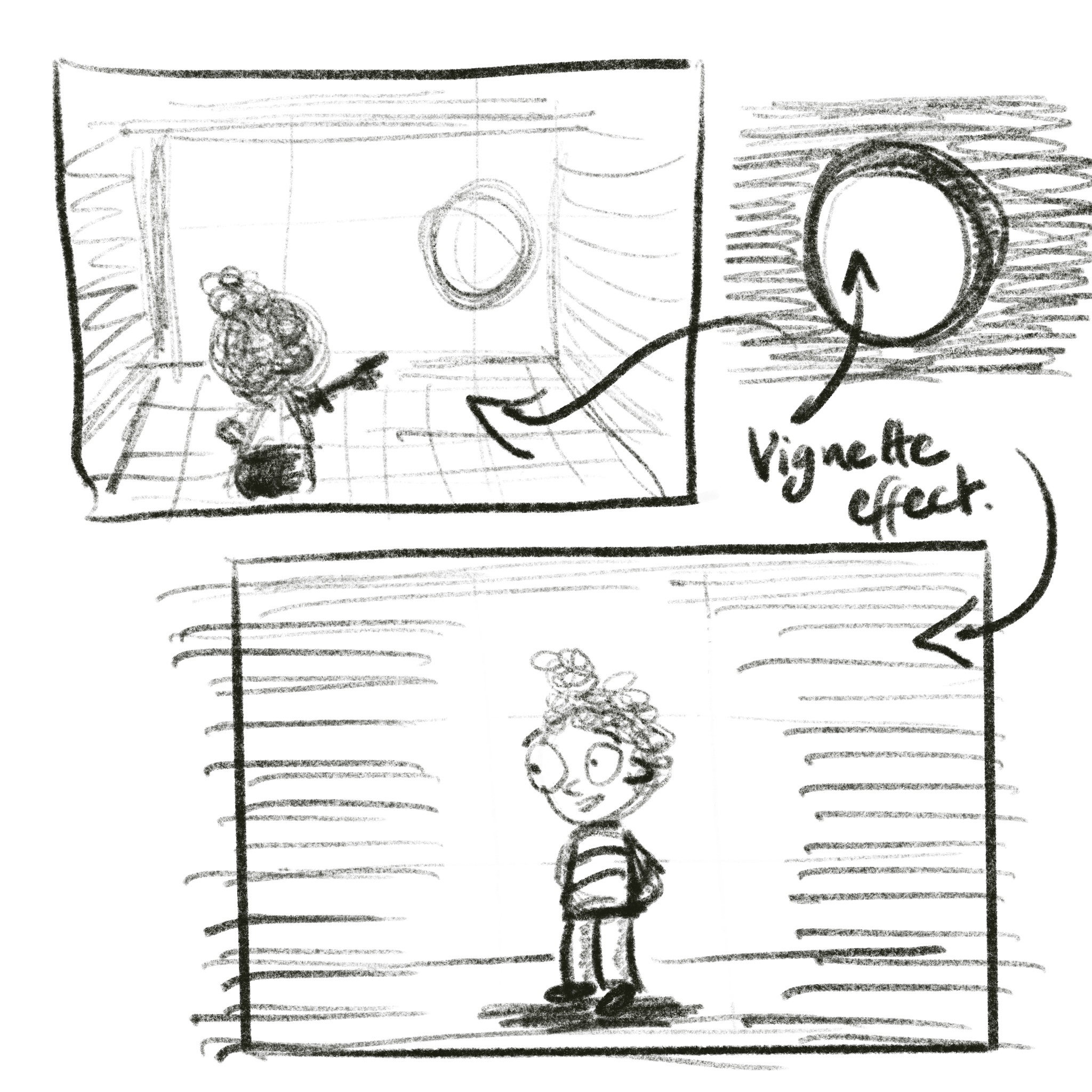
The spotlight – a.k.a. the vignette effect — is your best friend when it comes to creating focus in black and white cartoons.
Black and white cartoons are THE best for saving time, right?
They are a favourite go-to medium when I’m brimming with ideas I want to get on paper. Sticking with black and white means I can focus on telling the story in pictures for a bit longer, rather than feeling I need to hurry along and ‘get the colour done’.
The only problem is … black and white ‘toons do take more discipline
Without the easy win of spot-colour to direct the eye, I need to define my focal point and make it clear as daylight. With just black outlines and white spaces to work with, and perhaps some texture or pattern to definite walls and surroundings, I need to direct my audience’s eyes with purpose.
So how do you do that?
By creating a vignette effect
Imagine your focal point as the spotlit area, a window of light surrounded by comparatively darker, shadowy or patterned spaces and elements. This is how I think of creating the vignette effect in cartooning terms.
Vignette is a photographic term where, either by accident or design (these days by design, for special effect), the photographer produces an image smaller than the frame, with a crudely focused border.
The effect is a blurry, usually darker edge to an image, which forces the attention towards the lighter, central area. You can see me creating in action in the video demonstration down below:
Creating Vignette Effect for Laser-Focus in Black and White Cartoons
2 Superb Black and White Cartoonists I am Currently Fan-girling Over
Nick Galifianakis and Connie Sun have very different styles, but both use black and white almost exclusively on Instagram, and both are class acts of whom I am in awe. Join me in admiration.
First-off, Nick G… just because his scenes are more complex
Do you see how the diagonal grey line of the canopy shade above, and the ground-line + tabletop below, effectively compels us to gaze into the mid-section of the frame and focus on the conversation between the two women?
And then Connie, in this series of cartoon frames…
I love how she literally darkens the margins of the frame in cartoons 2 though 5 to keep us focused on the dialogue and action between her and the elephant. Not to mention how the ‘oppression’ of the speech bubbles at times also drives the focus down to the drama on ground level ?.
Final Thoughts on Creating Focus in Black and White?
- Remember that you’re the artist; you get to call the shots. Use whatever means you have at your brush-tip to direct your audience’s attention to exactly where you want it.
- The lightest, brightest area of the frame gets the attention. If you’ve left the ‘wrong’ place bright by mistake, think about how you can change that… black and white is very forgiving (and even more so if you are working in something like Procreate).
- If you have questions, you know where to find me ?

