My skills in Procreate cartoon watercolouring grew out of experiments, after using only analogue watercolour pigments. I use the term ‘digital watercolour’ to describe the result rather than the process, because painting digitally obviously has little overlap with ‘analogue’ painting. Digital cartoon watercolouring adds every colour pixel-by-pixel with an Apple Pencil; analogue watercolour lets wide swathes of colour wash organically across a page.
But there ARE cartoon watercolouring technique similarities between the two
These are the three techniques that result in vibrant cartoon colouring that “pops”:
- using low-opacity digital ‘paint’ (so that the white of the digital canvas shows through)
- selecting a limited palette and combining ‘washes’ to create deeper hues and shadows rather than constantly searching for the “perfect colour”
- applying a variety of colours to mimic the real world e.g. we tend to think that leaves are green and tree trunks are brown until we try to paint them… and then realise that nothing could be farther from the truth 😉)
With ‘analogue’ watercolouring I bought just a few specific colours…
… because I could use them to make all the colours I needed.
This was good news because I was a newbie just dipping my feet into a new pastime and pigment watercolours are jolly expensive. Huzzah for digital pigments that you can pick up for free!
At the time my children were teeny and I was learning about primary and secondary colours with them, which helped inform my colour-mixing experiments.
In case you can’t remember (or haven’t learned yet 😅) this is how it works:
There are 3 primary colours: red, blue and yellow
> If you combine each of these with just one other you are able to create purple, green and orange
> When you mix all three, you get muddy brown (“muddiness” is a definite problem in analogue watercolours, not so much digitally!)
If you are familiar with the colour wheel, the colour combining will make sense…
Purple sits between red and blue on the colour wheel;
Similarly, green sits between blue and yellow;
And finally, orange sits between red and yellow on the colour wheel.
So, what were those original cartoon watercolouring purchases?
Cobalt blue – a clear blue
Yellow ochre – an earthy yellow
Lemon yellow – a clear, pale yellow
Burnt umber – a deep brown
Alizarin crimson – a lively crimson ‘red’
French Ultramarine – deep, grainy ‘navy’ blue
Viridian – a (weirdly indescribable) dark green
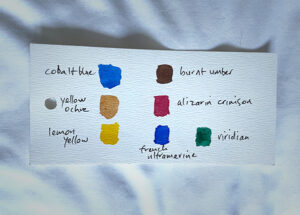
~ my original analogue watercolour paint colour purchases
I had no intention of recreating this cartoon colouring palette digitally
But guess what?
A brief look reveals that I have similar colours to these that I use all the time in my custom Procreate palettes. So I have realised that the intuitive colour understanding I now bring to Procreate (and watercolour pencils) is a result of the hands-on years of splashing around using real paint out of tubes
As you can see that there great similarity to the watercolour pigments I started out with. Take a look below and judge for yourself…
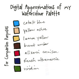
~ digital approximations of my original watercolour palette
Is this similarity even significant?
Absolutely! My use of these colours digitally is influenced by how they work in pigment.
This video delves a little deeper. Take a look and see how it details the three techniques I talk about to build digital cartoon watercolouring effects:
Fast Colour in Procreate goes on sale 22 January 2022 – but only to the Waiting List
If you’d like to be included, you can sign up to the Waiting List at the link below:
https://forms.aweber.com/form/61/1151342961.htm