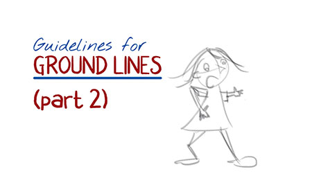
Does your character often look precariously balanced on the ground lines or shadow at her feet?
 Following on from last week’s post about beating the Float Factor, here’s a simple trick to move from grounding your cartoon character perfectly and also adding depth to every scene. The beauty of it is that there is nothing technical involved — it’s just a matter of positioning.
The best place to position your ground lines
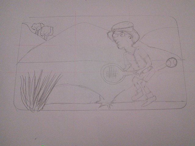
Your first instinct may be to put ground lines right under your cartoon person’s feet. It’s logical. However, that is often close to the bottom of the page, and leaves a large, lonely space all over the rest of the page.
What to do about it? Take a look below:
The Da Vinci cartooning course sells out every June!
Here’s what Jennifer B had to say:
Drawing was more difficult that I expected
One of the main reasons I took this course was to challenge myself to do something completely different. I also wanted to learn to do cartoon illustrations for the materials I do for clients, but I really didn’t know how realistic that was — after all, I had no experience of drawing.
My biggest concern was that I wouldn’t improve
Each week the lesson was broken down into small steps that built on each other. It took a while, but I began to notice that things I had struggled a lot with earlier on now felt easier. I must be learning something!
Learning in a group makes all the difference
Knowing that your fellow students visit from time to time to read your posts and comment really helps when you can’t see your own progress. It’s good to have a teacher and class buddies who remind you of what is not always clear to you.
Alison is dedicated to her students’ success
She is responsive and always has a suggestion up her sleeve of another approach when something is not working. Her creativity is infused into her teaching. She is very patient and seems to be able to manage to teach a group at different levels.


