What do cartoon illustration and lemon meringue pie have in common?
Well, my mother lived in awe of her best friend who was an incredible cook. This friend, Angela, threw dinner parties complete with homemade desserts to die for and then claimed cook’s privilege and demolished any left-overs for breakfast!
Lemon meringue pie before sunrise?
Bring it on, I say ?.
The funny thing was that while my mother always muttered, “I can’t cook like Angela,” I discovered the boot was on the other foot. By Angela’s own admission, my Mum is a stellar cook; she’s just too modest to give herself credit for it.
And guess what? There’s a good chance that you’re hiding your light under a bushel too, because you don’t realise the your cartoon illustrations are far higher quality than you think.
Think about it
You hit “Post” to release your latest cartoon illustration to the world via Facebook — and instantaneously see countless tweaks that would improve it by leaps and bounds.
So you delete the post and go back to the drawing board… digital or otherwise.
What if you had an objective way of assessing your cartoon illustration?
A way of looking at the big picture and making sure the important boxes are ticked instead of nit-picking about the tiny elements?
There is a gigantic freedom that comes from critiquing your cartoon illustrations using an objective framework.
This seven-point list will help you to get the important elements in place in your work so that you can set it free joyfully, without feeling you’re setting yourself up for ridicule.
(Of course, if truth be told, we are our own harshest critics. 98% of the time, no-one else sees the details that we think are glaring errors. But let’s leave that discussion for another day.)
The Lemons to Lemon Meringue Checklist
Ask yourself these seven questions before you get to muttering about flaws anywhere else in your cartoon illustration.
1) Have I directed the viewer to a specific focal point?
2) Have I used the Rule of Thirds to compose my cartoon?
3) Is there contrast (in terms of colours used, and possibly size of objects)
4) Is there adequate value variation between the palest parts of the scene and the darkest parts?
5) Have I used some rich, vibrant colour?
6) Is there a distinct foreground, middleground and background in the scene?
7) Have I used directional lines appropriately?
What do I mean by these terms? A picture speaks a thousand words, so here are several thousand words’ worth to help illustrate the concepts I’ve listed ?
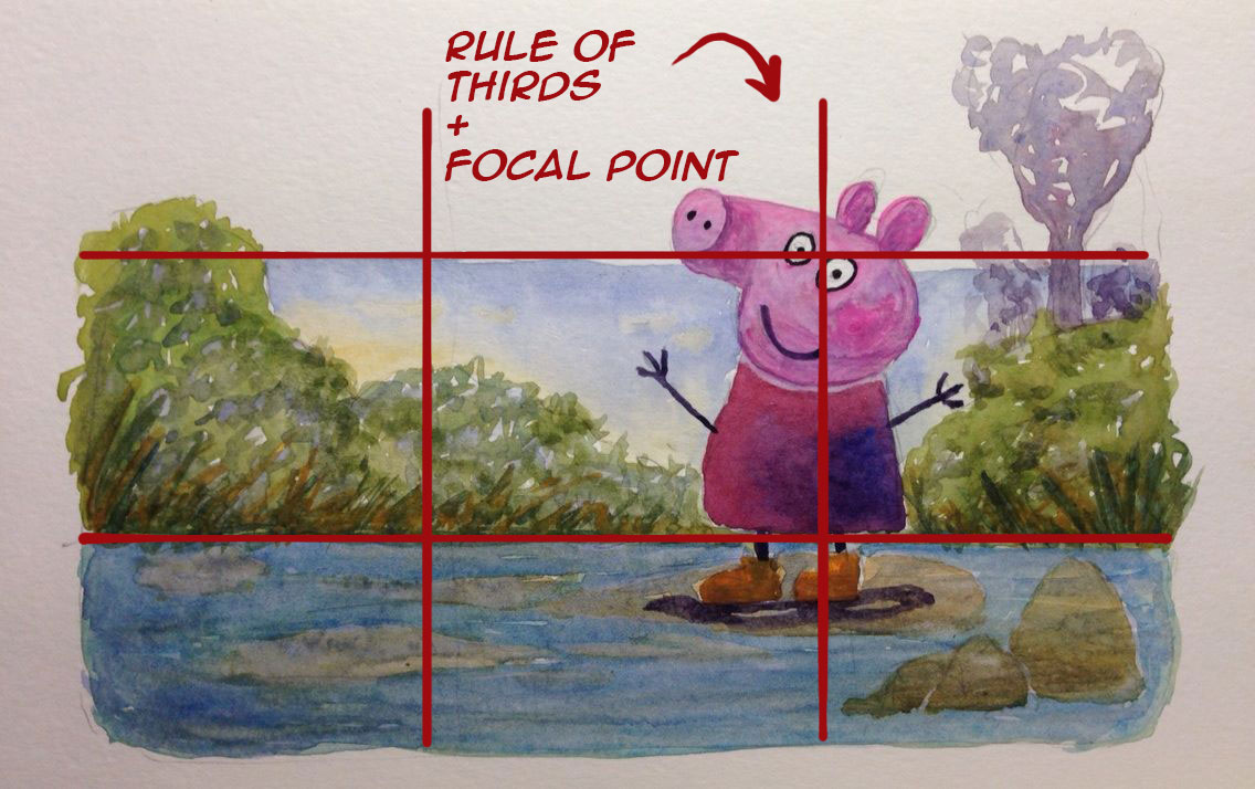
Focal Point + Rule of Thirds
As the artist, everything you do is purposeful because you want the viewer to see and interpret your work in a certain way. The first thing you do is determine the focal point of your cartoon: exactly where you want them to look. One of the easiest techniques to kickstart this process is to use the same rule of thirds grid you would use in photography, and position your focal point at or near one of the line intersections on that grid so that your viewer’s eye falls on it automatically.
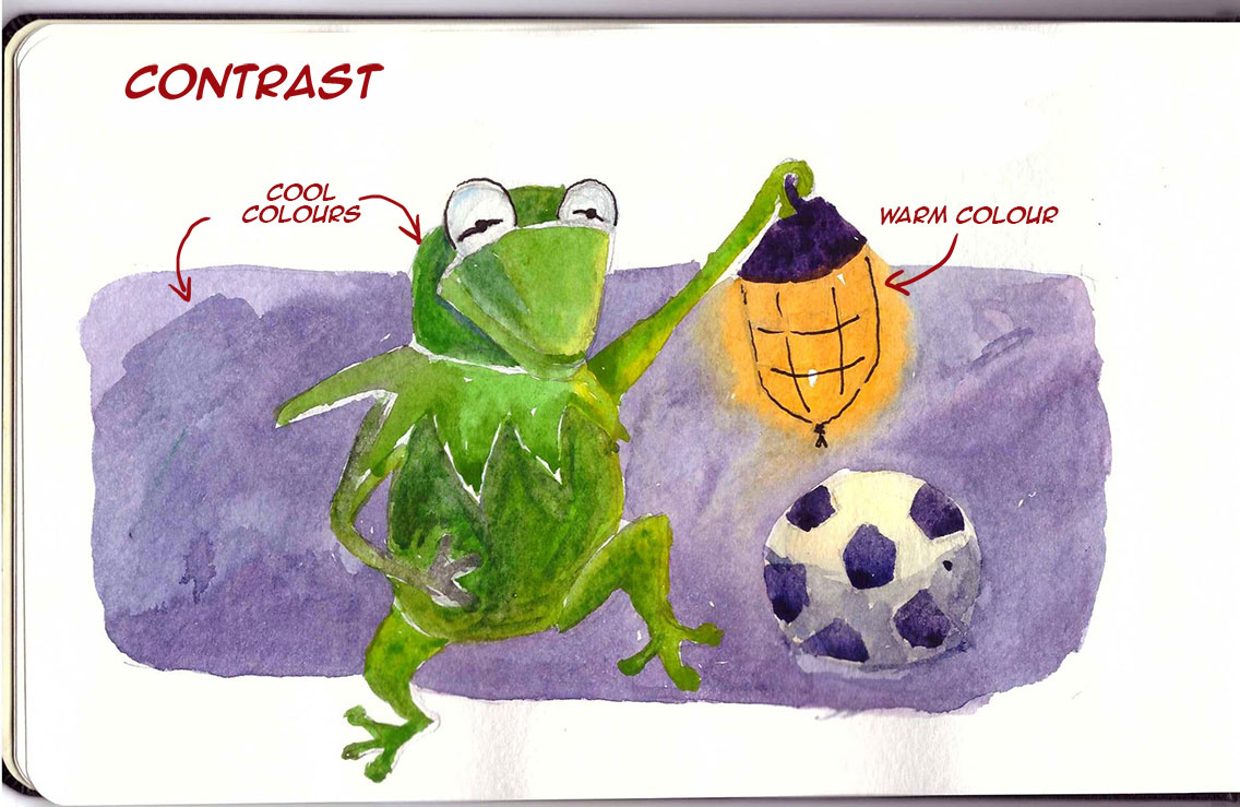
Contrast
Contrast is what makes things interesting, both in life and in art! When it comes to colour, you want to use contrast to avoid bland ‘sameness’ in your cartoons. So if you’re using predominantly cool colours, create contrast by having a spot of warmer colour, too.
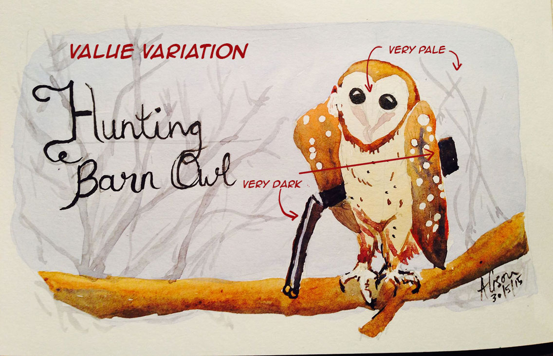
Value Variation
Talking about values is just a term that refers to paleness vs. intensity. So in the cartoon below you can see that the pale areas such as the key and the owl’s face are are very pale indeed, whereas the hunting rifle, the wingtip and the underside of the branch are a incredibly intense. Having this contrast (there’s that word again) creating a more vibrant end result.
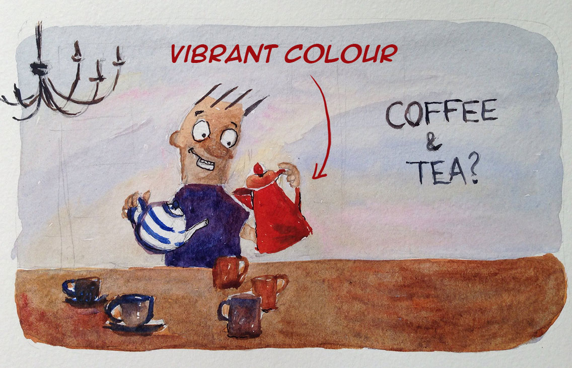
Rich vibrant colour
There is a lot of theory behind the use of colour and it’s easy to overdo it. However, if you make sure that you have just one of two areas of intense, vibrant colour in each cartoon illustration, you will bring them to life without overpowering your viewer.
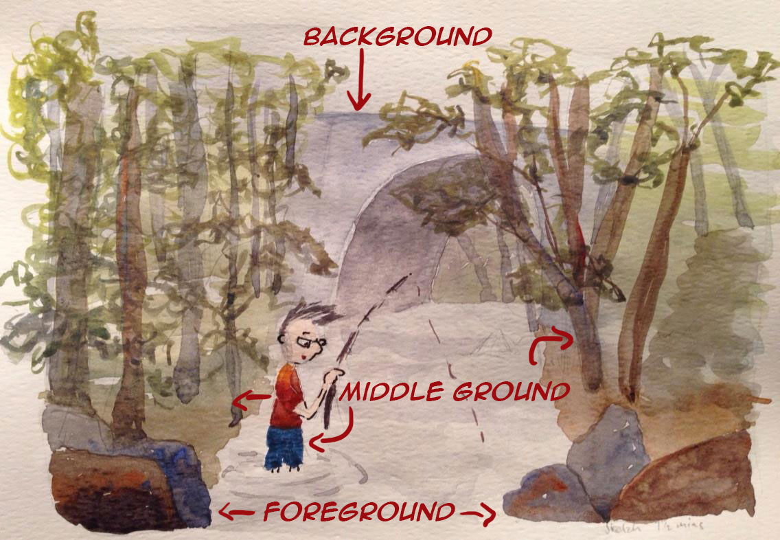
Foreground, Middleground and Background
Injecting death into a scene comes from creating rich scenes across a variety of planes, namely the foreground (closest to the views) the middle ground (where most of the action usually happens) and the background which provides context and interest. Clever use of these planes makes your viewer feels if they could step into the frame and take part in what is going on.
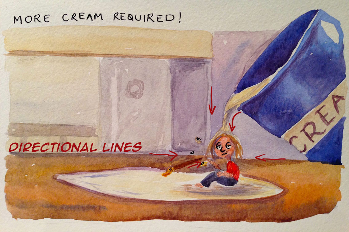
Directional Lines
You’re the artist! You’re in charge! Remember that every line that you let into a picture can either enhance or detract from the focus. “More cream required” down below is a good example of how you can use directional lines to point to the character as the focal point of a cartoon.
Your inner critic is always on hyper-alert, pointing out flaws in what you are producing. It’s undermining, debilitating, energy sucking.
But it doesn’t have to be.
Next time you catch yourself thinking “it’s not good enough” about your cartoon illustration, whip out my Lemons to Lemon Meringue Pie checklist and apply some objectivity to your assessment.
I guarantee you, your work is better than you thought.
***
Got a question? Looking for input? Mail me, it could be the start of a beautiful friendship ?.